OCC Branding
Tone of Voice
Our tone of voice reflects our brand personality, helps us better connect with students and makes us stand out from other colleges. It describes how rather than what we want to communicate.
Through a consistent brand voice, we build an emotional connection with our internal and external audiences that encourages dialogue and a strong desire to choose OCC over our competitors.
Our Personality
Having a distinct personality makes us relatable and memorable. Since our highest goal is to inspire students to achieve their greatest potential, the attributes that best describe us include:
- Cheerful - we have an optimistic view of the world and celebrate moments big and small
- Futuristic - we embrace change and welcome whatever tomorrow brings
- Trustworthy - we honor integrity and speak truthfully, always being our authentic selves
- Confident - we are knowledgeable and informative
- Inclusive - we create a place where everyone can thrive
To better understand these ideals and see our voice in action, please view the following examples produced for our latest advertising campaign “Start Your Someday.”
Helpful Guidelines
Honor all audiences | All communication should be student-centric while keeping parents and community members in mind.
Talk Like a Person
Avoid jargon while keeping copy simple and clear. Let’s talk to people like people.
Be Positive
All writing should have a hopeful tone and avoid words that sound negative like “don’t” or “can’t.”
Logo
Downloadable OCC logos


Fonts & Typography
The font family used for OCC is Avenir Next. Avenir Next is a clean, modern typeface with numerous weights available. Avenir Next is the primary group of fonts used throughout the OCC brand, however, Avenir Next Condensed is available to use occasionally for promotional material and ad campaigns.
The style in which text is expressed is typography. Good typography enforces hierarchy. It can break up messaging and help with readability. Consistent typography is one of the foundational elements of the OCC brand.


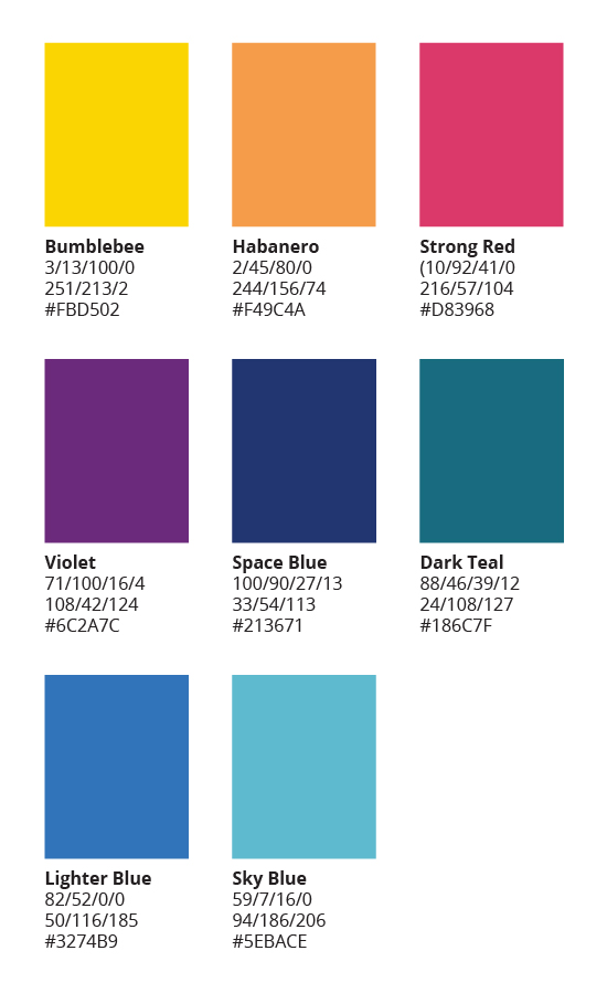
Colors
OCC’s color palette is broken up into primary and secondary colors. OCC green must be represented in any form of media in some way but does not have to be in the dominant color.
Secondary colors and tints may be used on a situational basis such as promotional materials and ad campaigns. The legibility of text must be a critical consideration when using color. ADA compliance must be maintained at all time.
Primary Colors |
Secondary Colors |
 |
 |
Web Accessibility Statement
Although we strive to make our content fully accessible, we know some barriers remain. We welcome your feedback. Please let us know if you encounter inaccessible content on the OCC Website. Read our more detailed web accessibility information.